☰
Search
FIND DATA:
By Journal
|
Sites
ANALYZE DATA:
Help with
R
|
SPSS
|
Stata
|
Excel
WHAT'S NEW?
US Politics
|
IR
|
Law & Courts
🎵
FIND DATA:
By Journal
|
Sites
WHAT'S NEW?
US Politics
|
IR
|
Law & Courts
🎵
WHAT'S NEW?
US Politics
|
IR
|
Law & Courts
🎵
Streaming Excel Tutorial Videos for Graphing Relationships & Describing Patterns
Home
›
Excel Companion
›
Tutorial Videos
› Graphing Relationships & Describing Patterns
Watch & Learn:
Graphing Relationships & Describing Patterns
►
Working with Different Chart Types
i
Demonstrated with book sales data (4:30).
.
►
How to Create 100% Stacked Column Chart
i
Chart option for qualitative dependent variable (4:58).
.
►
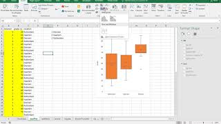
How to Create a Boxplot
i
Comparing numeric values across multiple categories (2:02).
.
►
Basics of Graphing in Excel
i
(10:48)
.
►
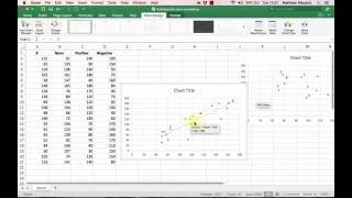
Creating a Scatter Plot
i
Shows you how to make a basic scatterplot and edit it for clarity (4:38).
.
►
How to Create Multiple Line Chart
i
Plotting two or more lines that have the same x-values (7:27).
.
►
Charts & Graphs to Visualize Quantitative Data
i
Shows how and when to create different types of charts (34:32).
.
►
How to Make a Line Graph
i
Show you how to create and edit a line chart (6:07).
.
►
Creating a Boxplot
i
Tutorial from Todd Grande (12:03).
.
►
How to Make and Interpret a Scatterplot
i
From Matt Macarty (7:08).
.
►
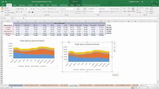
Creating Area Charts to Visualize Data
i
Shows how and when to create area charts (4:41).
.
►
Side-by-Side Boxplot Tutorial
i
For Excel 2016 and later versions (3:08).
.